Here's my quick post about how I customized my Gantt chart to colour my chart based off dates and adding a couple more data guidelines. Please note that you will need to follow the original article before starting this...
What have you finished and what is in progress
First of all, here's my data - as you can see it covers three months of work.
In the standard chart I have added colours, that highlight which jobs have been completed and which ones are in progress.
To add colours to highlight individual items, open your chart and go to the expressions tab, expand the expression, select background color and open the Definition box.
And this is the formula that I have used, current work is set as orange whilst completed are set to red. (Days field in this is equivalent to Duration in the original post).
Where are we/What Month is this?
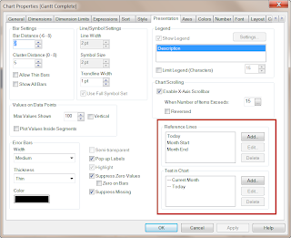
Next I wanted to see the work that I had to do in the current month, I've done this using Reference Lines and used some text in chart to ensure that the data is easy to read.To add reference lines, open the chart properties and select the Presentation Tab.
Links


I have developed a dedicated Gantt Chart extension object for QlikView that you also might want to try.
ReplyDeleteYou can download it from QlikCommunity here:
http://community.qlikview.com/docs/DOC-3427